


EWENIVERSE is a playful exploration of how interface design can support clarity and connection in complex, management-based game environments. Set in a whimsical galactic world, the project focuses on keeping players emotionally and cognitively connected to their herd through visual feedback and interaction design.
TEAM - 1 UIUX Designer (Me), 1 Engineer
MY IMPACT - Led UI/UX design, interaction systems, visual direction, prototyping, and motion feedback exploration
SCOPE - GAME UI/UX, System design, Technical prototype, Motion Studies
DURATION - 4 months
TOOLS - Unity, Blender, Figma, Miro, After Effect, Photoshop


In a fast paced, multi-entity management game, how can players understand what actions are available, where they apply, and what their outcomes will be—without relying on heavy UI?

Reference Study: Pikmin’s Command cue and Feedback System
To better understand how players manage multiple entities through limited controls, I analyzed Pikmin 4 as a reference for its intuitive tool system and use of spatial feedback. The game coordinates large groups of agents through in-world cues and contextual responses rather than heavy UI, making it a strong case study for designing clarity in real-time interaction.

OBSERVATIONS/BREAKDOWN - Calling and Return Pikmins


(1) INTERACTION PATTERN:
Color-coded cursor communicates which Pikmin type will act and where, using spatial feedback instead of heavy UI.
(2) FEEDBACK SYSTEM:
Visual and audio cues confirm when actions are available and successfully triggered. e.g. color changes, sound effects, and contextual pop-up prompts indicate when an action (such as throw, gather, or attack) can be performed.
(3) STATE COMMUNICATION:
Group states are conveyed through animation and movement rather than interface panels, enabling players to read system status directly from in-world behavior.
(4) AFFORDANCES:
Consistent color and behavior mapping across Pikmin types reduces cognitive load and supports rapid recognition during real-time decision making.

(6) SPATIAL MESSAGING (AoE FEEDBACK)
An expanding area-of-effect visual communicates action range and scope, enabling players to anticipate outcomes and coordinate multiple agents(pikmins) before committing to an action.
Synthesizing insights from interaction patterns observed in Pikmin, I translated these findings into a set of design principles that guided how EWENIVERSE addresses the challenge of managing multiple entities through clear, real-time feedback.
Visual Cohesion Across Systems
Color, motion, and form function as a shared visual language across tools and states, enabling consistency and reducing cognitive load.
Behavioral Cues Over Explicit Controls
System availability and outcomes are communicated through behavior, animation, and response patterns, reducing reliance on instruction-heavy UI.
Motion as System Feedback
Animation communicates causality, timing, and consequence, allowing players to perceive system changes in real time.
Spatial Feedback Over UI
Spatial cues, in-world markers, and area-based feedback communicate intent and scope, enabling players to interpret actions without persistent UI elements.
Guided by these principles, I identified 3 design challenges in EWENIVERSE:
(1) REAL TIME ACTION CLARITY
Players need to understand what actions will do, where they apply, and what outcomes to expect without relying on too much UI.
(2) MOMENT TO MOMENT FEEDBACK
System responses must be immediately readable through motion, animation, and visual cues to confirm player actions.
(3) PAUSE & SYSTEM UNDERSTANDING
Players need a way to step out of real-time interaction to review system state, plan actions, and understand tool behavior.


✦ GENERAL PLAYTEST OBSERVATIONS
"Players repeatedly triggered tools to “test” their effects"
"Players could not predict how many sheep would respond"
"Aiming felt unclear across tools"
"Lack of trajectory and target visibility made interactions feel imprecise"
✦ KEY INSIGHT
Players lacked predictive clarity, which they could not understand outcomes before committing to an action.

#1 PROBLEM with the Early ROD TOOL design
Players could trigger the rod without understanding its area of effect, making outcomes difficult to predict and reducing confidence in the system.


✦ EXPLORATIONS & ITERATIONS
To improve predictive clarity of the rod’s area of effect, I conducted A/B testing on different AoE interaction models, evaluating both feedback communication and input flow.
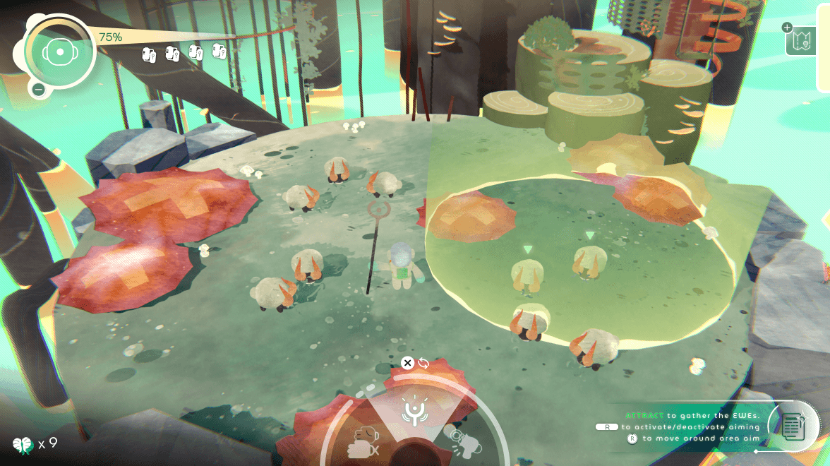

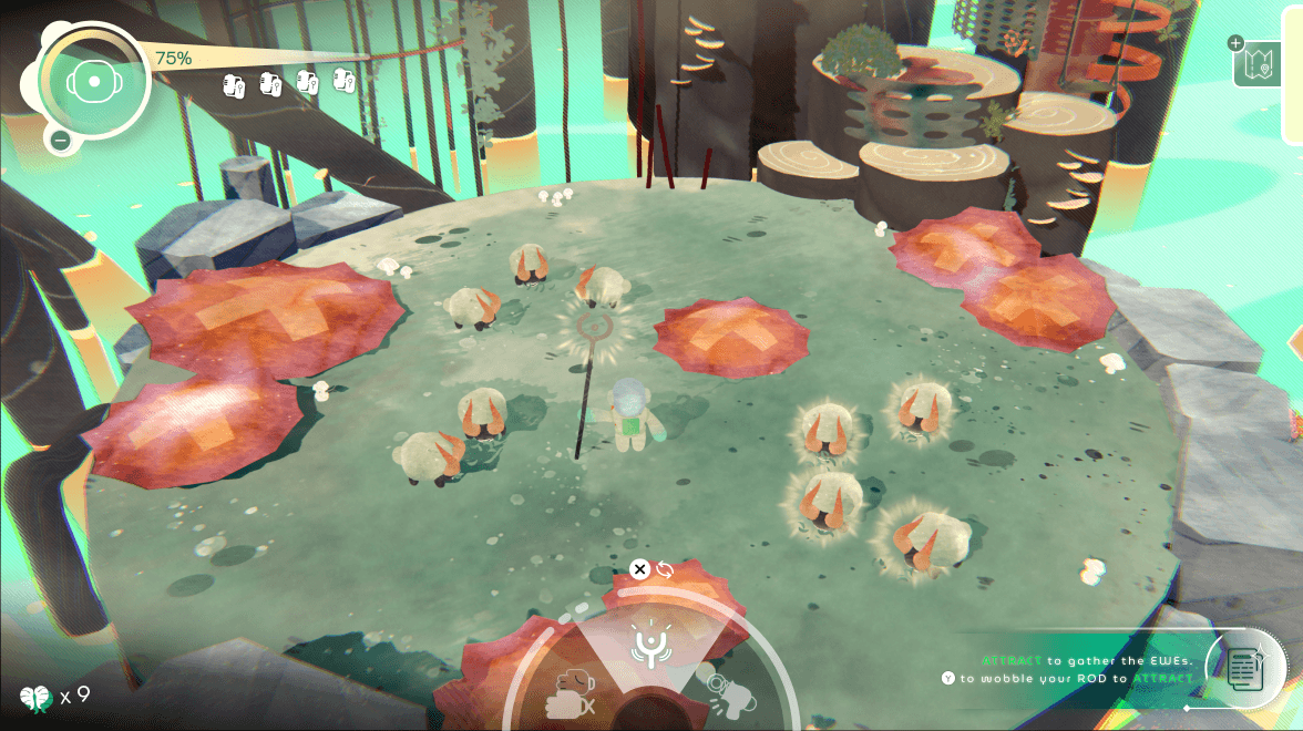


[Approach A] — Cursor-Based Targeting (Decoupled from Player)
✔️ Precise placement
✖️ Slowed interaction, increased input cost
Observation: Decoupling the AoE from player movement caused players to focus on UI positioning rather than spatial interaction with the environment.
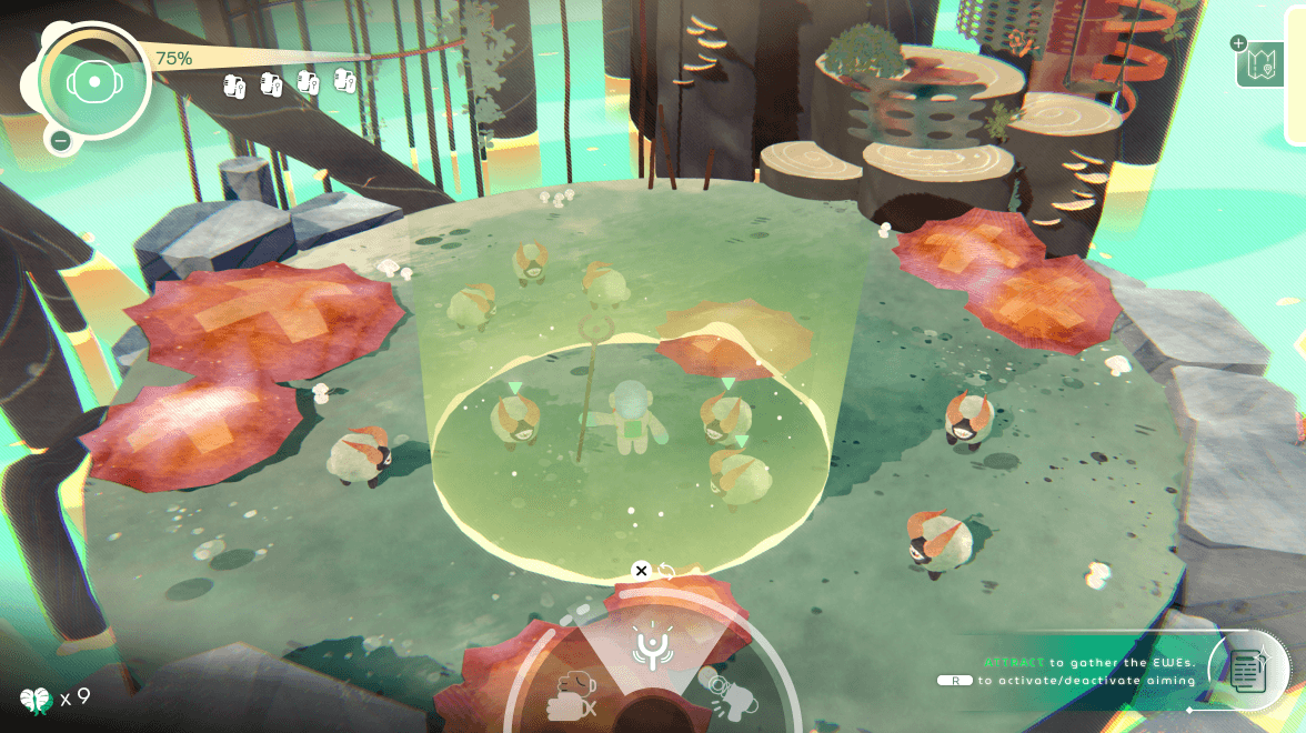

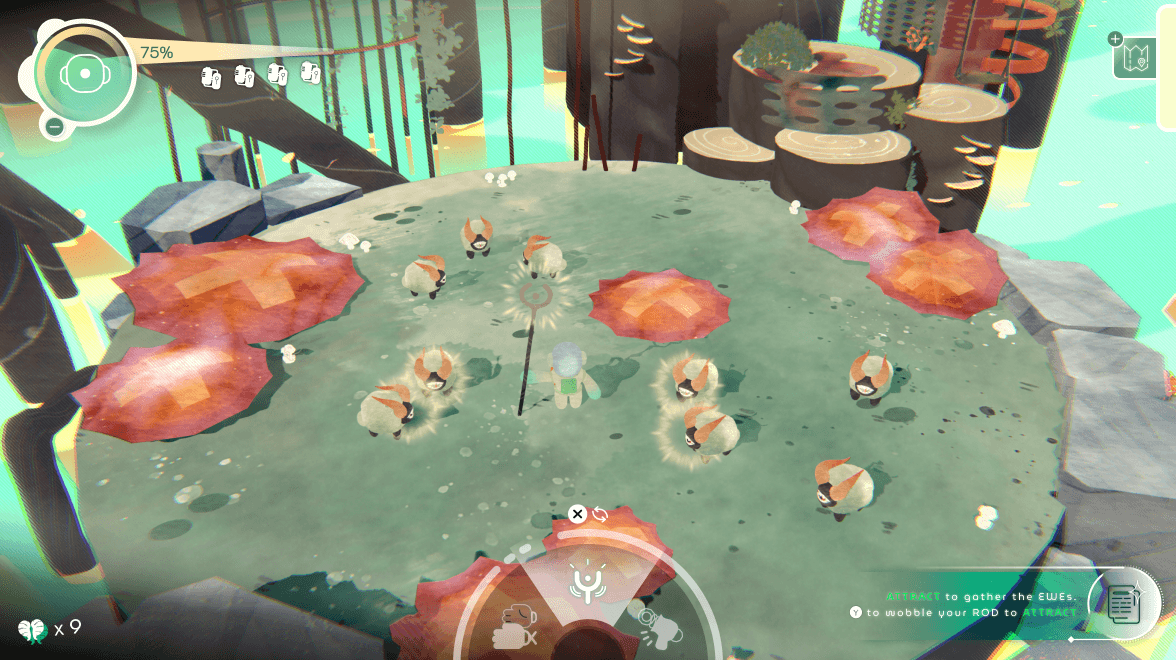


[Approach B] — Player-Centered AoE (Coupled to Player Movement)
✔️ Faster, communicates range dynamically
✖️ Less precise targeting
Observation: Coupling the AoE to the player improved spatial predictability, allowing players to anticipate outcomes through movement rather than cursor positioning.
Approach A separated targeting from player movement, adding extra interaction steps and cognitive load.
Approach B coupled movement with effect, reducing input friction and making range easier to predict in real time.
Precision targeting also overlapped with directional tools (Light Gun, Grabber), weakening tool differentiation and interaction clarity.
I selected [Approach B] to prioritize:
Speed in multi-entity interaction
Predictive clarity of outcomes
Clear differentiation from precision tools
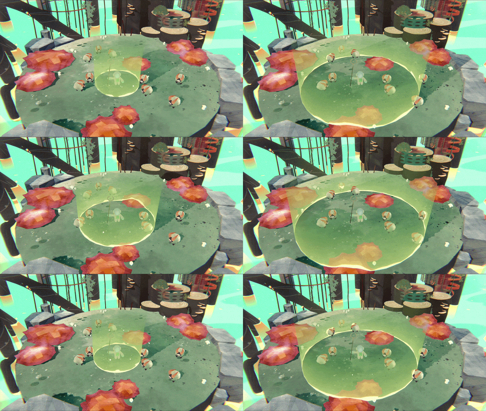
Sheep inside area preview expected response
No additional UI needed for prediction
Expanding radius communicates timing + range
By reducing precision and emphasizing area-based feedback, the rod establishes its role as a broad, predictive tool, distinct from directional and proximity-based interactions.


#2 PROBLEM with GRABBER & LIGHT GUN TOOL
Both the Grabber and Light Gun rely on directional targeting, but lacked differentiated feedback, making aiming unclear and causing the tools to feel functionally indistinct.

Using identical targeting visuals across tools reduced clarity and blurred their functional roles.
✦ SYSTEM RULE - Matching Feedback to Interaction Type

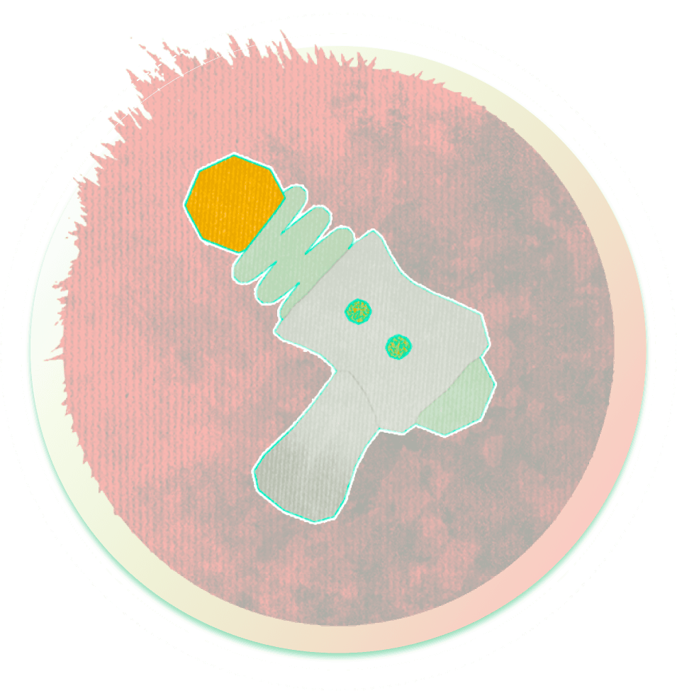
LIGHT GUN
Directional Tools → Directional Clarity
Question: “Where am I aiming?”
Uses:
trajectory line
reticle
target indicator

GRABBER
Proximity Tools → Proximity Clarity
Question: “What can I act on right now?”
Uses:
highlight
outline
soft radius / snap
✦ FINAL DESIGN DECISION


Light Gun: Trajectory line communicates direction and intent. Supports precise, high-consequence actions
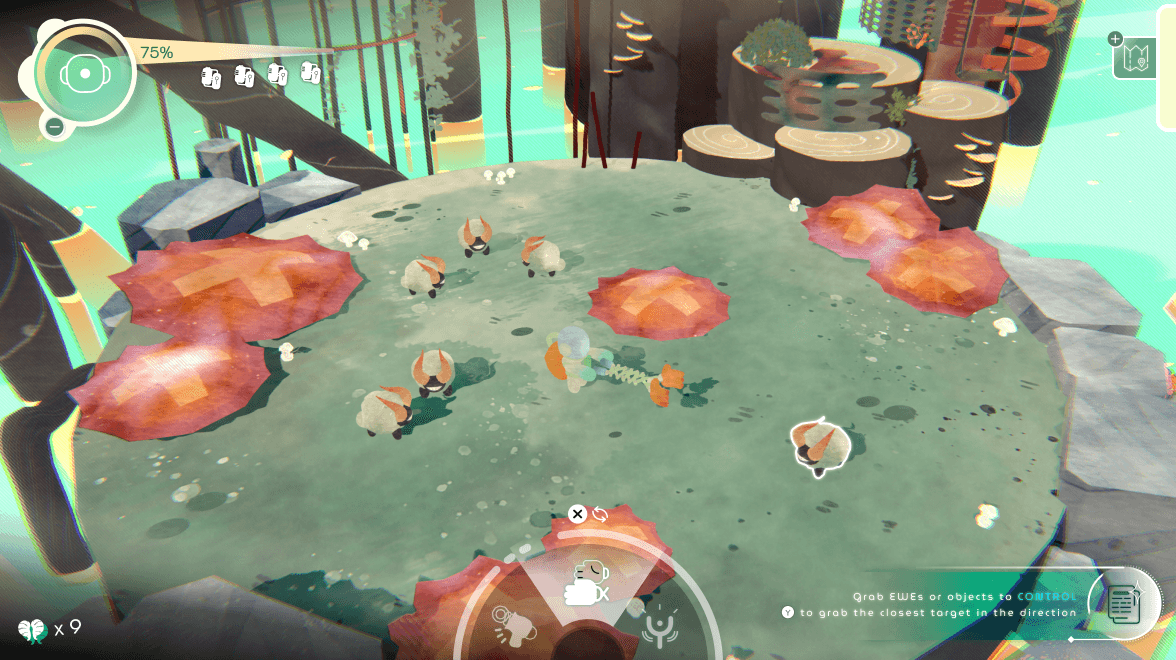

Grabber: Nearest target highlight enables quick selection. Prioritizes speed over precision





✦ THE PROBLEM
During real-time gameplay, information is communicated through motion and spatial cues. However, players needed a clear way to access system-level information (tools, status, inventory) without disrupting gameplay flow.
✦ KEY INSIGHT
Real-time feedback supports action, but players also need a reflective layer to understand systems, review state, and plan decisions.
A Reflective System UI that enables players to step out of real-time gameplay to review state, understand systems, and plan actions without losing context.
✦ EXPLORATION — CONTEXT vs CLARITY

Half-screen overlay
Tradeoff: keeps context, limits space
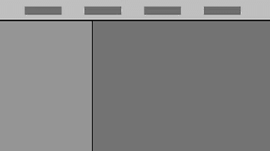
Full-screen UI
Tradeoff: clearer info, breaks immersion
✦ DECISION
I chose a full-screen, structured UI with contextual preview to support clarity in high-density information while maintaining spatial awareness.
Enables a clear separation between action (real-time gameplay) and reflection (pause state)
Improves scanability and hierarchy, which half-screen overlays could not support
Uses world previews to preserve orientation despite leaving gameplay
✦ INFORMATION ARCHITECTURE & STRUCTURE
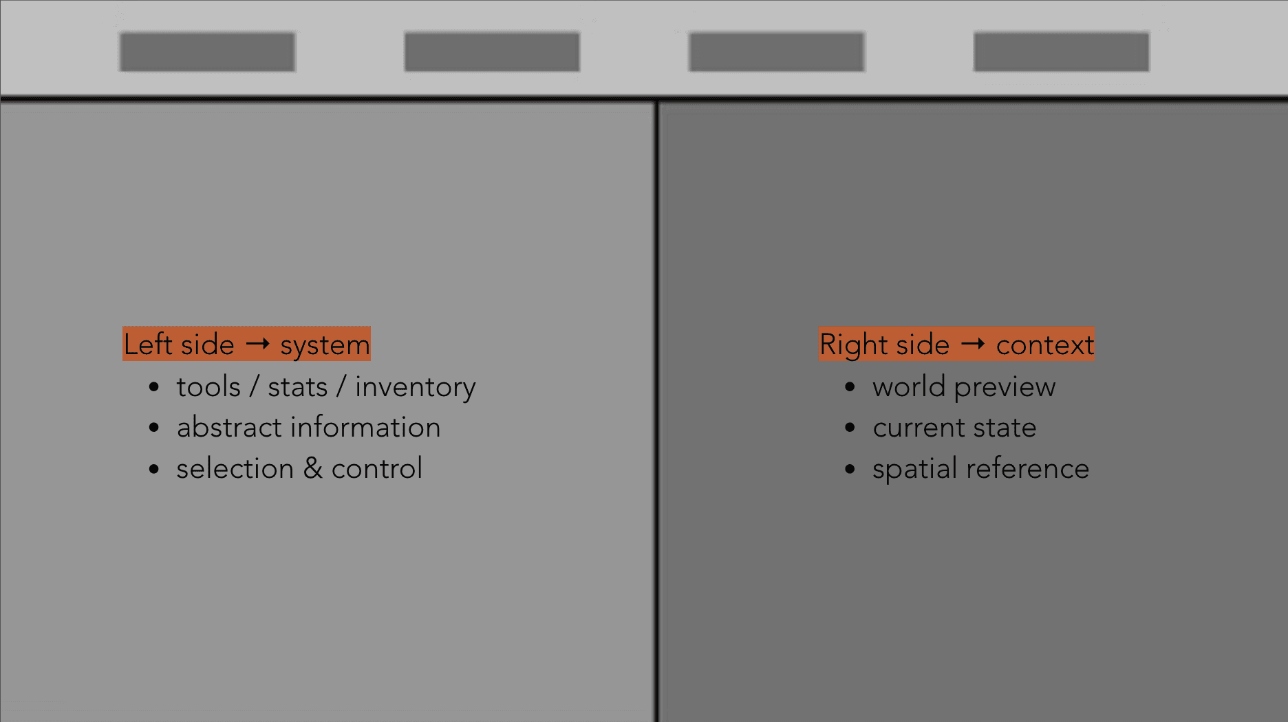
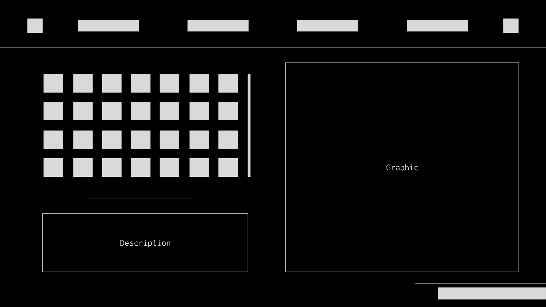
I established a consistent spatial structure where system information (tools, stats, inventory) is placed on the left, and contextual world previews are shown on the right.
This helps players quickly connect system knowledge with in-world outcomes, reducing cognitive load and improving scannability.



[1] Separate Action vs Reflection
Real-time = action, spatial feedback
Pause = pause, planning, understanding
[2] Structure by Player Intent & Importance
Status (current state) = now
Inventory (collected entities) = assets
Tools (capabilities & behavior) = capabilities
System (settings & meta info) = meta setttings
[3] Preserve Context While Paused
Maintain world preview
Avoid full disconnection from gameplay


[1] The pause menu is structured as a layered system (Status, Inventory, Tools, System), allowing players to quickly locate information based on intent.
[2] Consistent visual patterns (icons, color, layout) reinforce recognition and reduce relearning.


✦ KEY INSIGHT
Motion can communicate change, continuity, and focus—helping players understand where they are and what happens next.
I used motion as a functional layer to maintain continuity between gameplay, menus, and system UI to help players understand where they are and what changed.
✦ MENU → GAMEPLAY TRANSITION
Fade + expansion → signals entering world
Maintains continuity between UI and world, preventing abrupt context switching
▲ 01 Menu Screen
▲ 02 Option Menu
▲ 03 Biome Select
▲ 04 Gameplay - Tool Select, Map View
✦ TAB NAVIGATION (PAUSE UI)
Sliding motion → indicates spatial relationship between tabs
Preserves mental map of categories
▲ 01 Status
▲ 02 Inventory
▲ 03 Tools
▲ 04 System
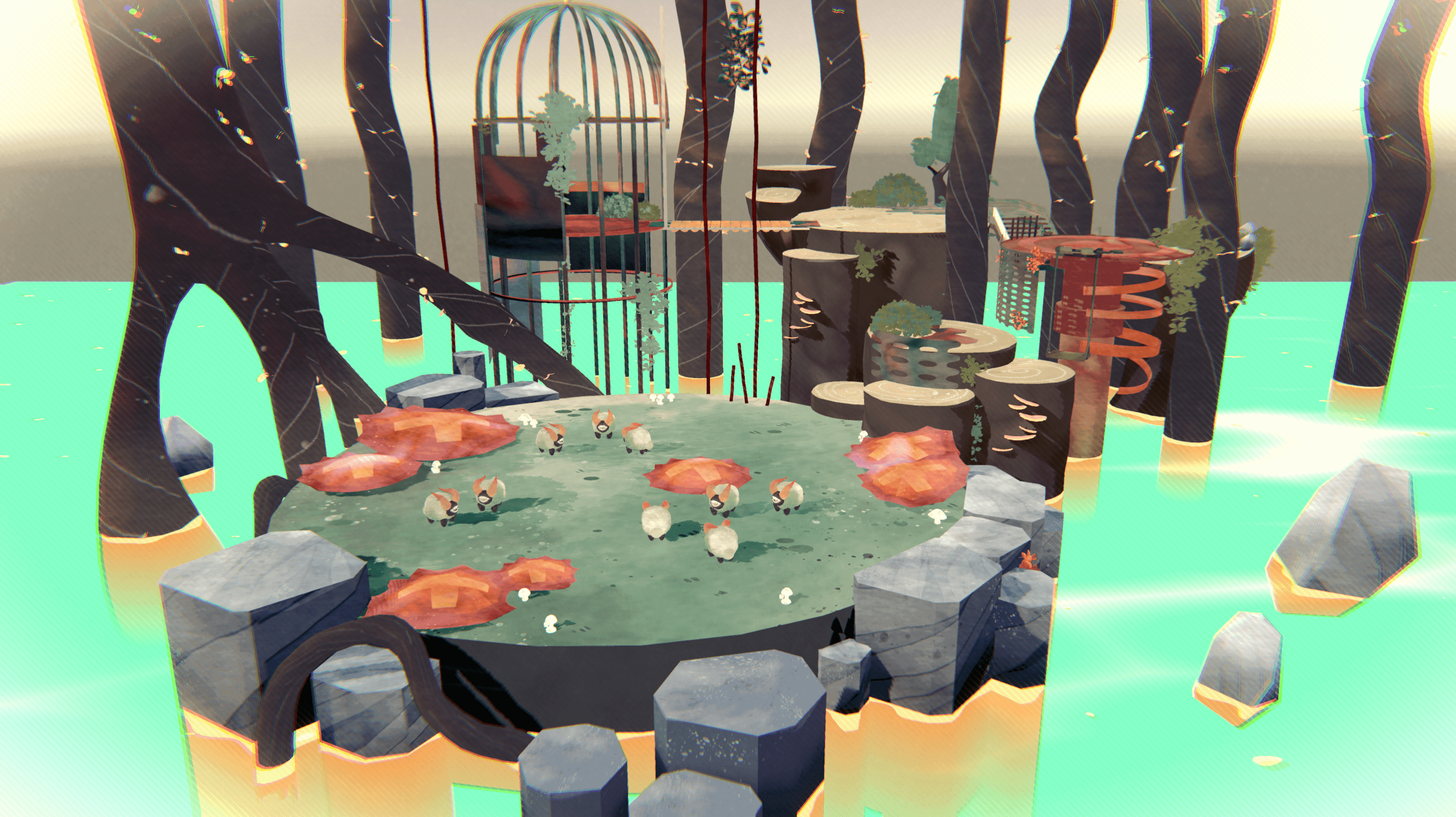

01 Exploring Thematic Direction & Visual Language
Defined Ewe-niverse’s playful sci-fi tone through moodboards, color studies, and shape language to establish a visual identity guiding both UI and world-building.

02 Early Interface Wireframes & Interaction Flows
Mapped core player interactions into low-fidelity wireframes to test hierarchy, screen structure, and user flow early in the design process.
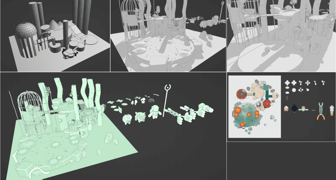
03 3D World-Building: Models, Textures, Props
Built a stylized 3D environment to contextualize the interface, using simplified forms and hand-painted textures to support clarity and readability.

04 Animation & VFX for Feedback
Designed animations and VFX as feedback systems to communicate success, danger, and player actions through motion rather than heavy UI overlays.

05 Custom Shader Development
Developed a custom watercolor shader to unify UI and world visuals while reinforcing depth, focus, and readability through consistent texture and color blending.

06 Unity Implementation & Integration
Integrated all assets in Unity to prototype the full experience and test interaction timing, feedback clarity, and real-time interface behavior.
LOGO
The Rod is a main/default tool used in the game by player to lead the sheeps. Thus, I made use of the element and combined it with the title's letter. and by adding some sort of splash effect I am able to reflect the function it brings in game: Guide & Influence > Gather.

ART DIRECTION
To define the UI and icon language, I developed a hybrid visual style that merges two contrasting aesthetics: a clean, rounded futuristic look and a rough, textured botanical feel.
This duality reflects the core setting of Eweniverse — a natural biome shaped by cosmic exploration.UI elements tied to the environment (containers, panels, holders) draw from the botanical side, using grounded textures and organic forms.

In contrast, UI components tied to the player (information displays, the tool-switching interface, and action prompts )— adopt the smoother, futuristic aesthetic, reinforcing the player’s identity as an astronaut navigating an untamed world.


STYLE GUIDE
The UI throughout the game continues to echo the key themes and ideas at the heart of the concept.
Larger elements like containers, holders, and area panels lean into the botanical side of the style, symbolizing the natural ground and environment.
In contrast, UI components related to the player, such as the information display, tool-switching interface, and action-based interactions during gameplay to lean more toward the futuristic, clean aesthetic, reflecting the player’s identity as an astronaut.


